Joey Lemons for Sheriff
Joey and I have been friends for years, and have spent more nights and late phone calls than either of us know talking about the day he would run for sheriff. When it finally happened, it was my honor to develop the brand messaging, create his visual identity, and manage his campaign for Sheriff of Stokes County, North Carolina.
The results? Joey won the primary with 76.87% of the vote. Though he ran uncontested in the General Election, Joey received almost 1,500 votes more than Congresswoman Virginia Foxx, who’d been on the ballot in North Carolina for nearly 20 years.
My Role:
Communications, Brand Creation, Campaign Strategy, Message Development, Earned & Organic Social Media, Visual Identity Architecture, Art Direction, Web Design & Management, Video Production, Publications & Direct Mail
‘The best we’ve seen’
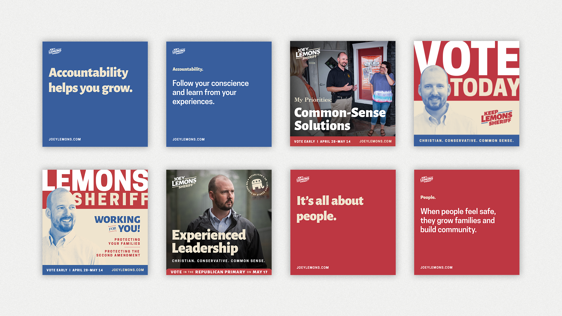
For a campaign who’s primary means of digital outreach was Facebook, we knew our target voters were a prime demographic on the platform. We decided a long form video would be the best way to get our message out and set the tone for the kind of campaign we intended to run. I wrote the script and worked with our videographer, Drake Springer, to storyboard it. After putting together a comprehensive creative brief for him and our photographer, Grant Miller, I art directed both shoots on location. The end product was incredibly well received, with some veteran NC political consultants calling it the best campaign video they’d seen.


Special Thanks:
Photography: Grant Miller Photography
Videography: Drake Springer
CASE STUDY
A campaign united in service, centered around positivity, and grounded in faith.
In February 2021, Joey was appointed Sheriff following the resignation of the incumbent. We had a year before the primary to set up a campaign apparatus, and only a few months before Joey wanted to file to run for his own term. Through a robust creative process and close collaboration with Joey and his wife, we arrived at a brand that reflected Joey’s vision and values.
We worked hand-in-hand throughout the campaign to iterate on the visual identity, develop messaging and campaign strategy, and create other designs for social, web, and video. The results amazed us.
Joey won the primary with 76.87% of the vote.
He received nearly 1,500 votes more in Stokes County than the incumbent Member of Congress received in her race, even though she had been on the ballot since 2004. He went on to win an uncontested general election in the fall, and was sworn in as sheriff in his own right in December 2022.
Brand Approach:
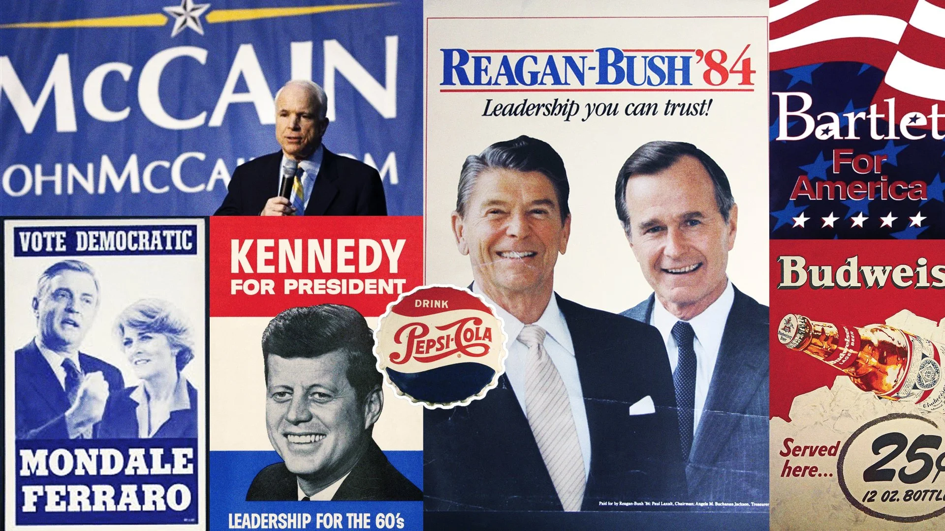
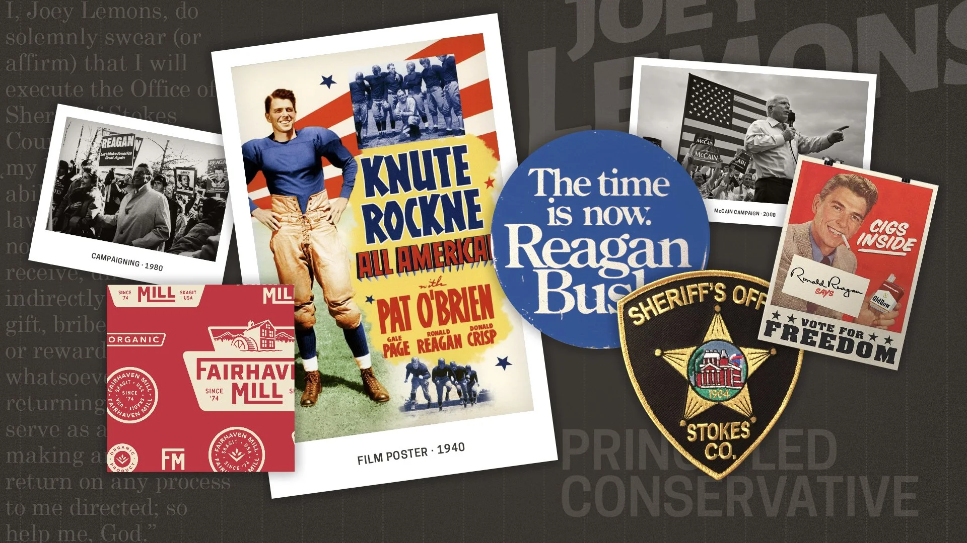
When asked who would play him in a movie, Joey responded with, “a young Ronald Reagan.” That response informed quite a bit of the visual identity, specifically color and typography. We wanted a visual identity informed by vintage campaign and film posters and advertisements. We wanted something classic that also felt fresh and engaging.
Our main inspiration was drawn from a poster for the 1940 film Knute Rockne All America. Additional inspiration was pulled from political campaigns of the 60s, 70s, and 80s, with a few more modern and a few older touches thrown in for flourish.
Execution:
Joey’s campaign marked the first time in recent memory that anyone mounted a proper campaign for any elected office in Stokes County. We were the first campaign in the county with a website, the first to actively fundraise, the first to put out an announcement video, the first to do direct mail, and the first to conduct get-out-the-vote operations.
With so many new campaign features, we wanted a visual identity that our voters would find familiar, comforting, and relatable. We wanted to emphasize Joey and his wife’s education, but not beat people over the head with it. And, most importantly, we wanted the entire brand, including the visual identity, to be grounded in Joey’s values: People, Authenticity, Integrity, Determination, Reliability, Accountability, and Optimism.

Logo System:
I developed a logo system comprised of a badge, primary and secondary logos, a bug for small use cases, and a circular badge for use in social media avatars. Having a suite of logos allowed for the identity to be conveyed in a variety of different applications, and enabled us to tell a more robust brand narrative.

Typeface Exploration:
The typefaces I chose were humanist, elegant, and ubiquitous so as to feel familiar. The unique angles of the letterforms of Alegreya Sans evoked the quirkiness of the typeface used in the Knute Rockne All American film poster. Century Schoolbook was inspired by textbooks used in schools around the country, and helped us showcase Joey’s education and his wife’s vocation as a teacher in subtle ways. Finally, Cooper Hewitt was inspired by the block lettering in Ronald Reagan campaign posters, and helped provide a modern counterbalance to other more traditional elements.