Americans for Prosperity
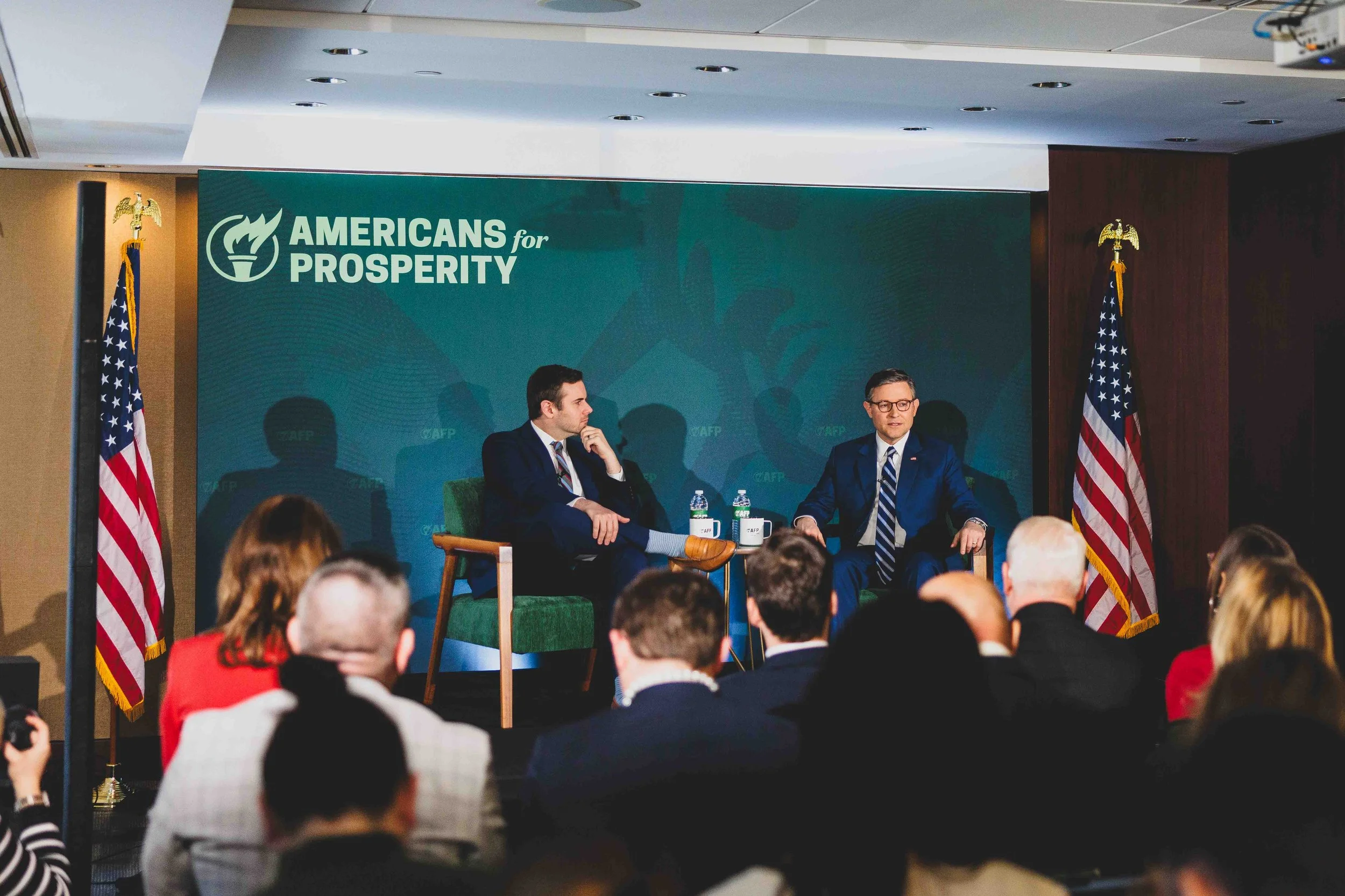
Americans for Prosperity (AFP) is one of the largest grassroots organizations in the United States. Ahead of marking it’s 20th anniversary in 2024, AFP wanted to refresh it’s brand to more closely reflect the current state of the organization, better connect with it’s key audiences, and provide key constituencies in AFP state chapters with the resources they need to be effective. Our internal design team was given about two months to conceptualize, refine, pitch, and execute a new visual identity.
My Roles:
Narrative Development, Visual Identity, Identity Architecture, Art Direction, Publications, Environments, Merchandise


Special Thanks:
Research & Positioning: Daniel Bassali
Design Support: Matt Rhodes, Cameron Atkins, & Kate Couturier
Additional Support: Stephanie Nelson
Production Vendor: Poolhouse
CASE STUDY
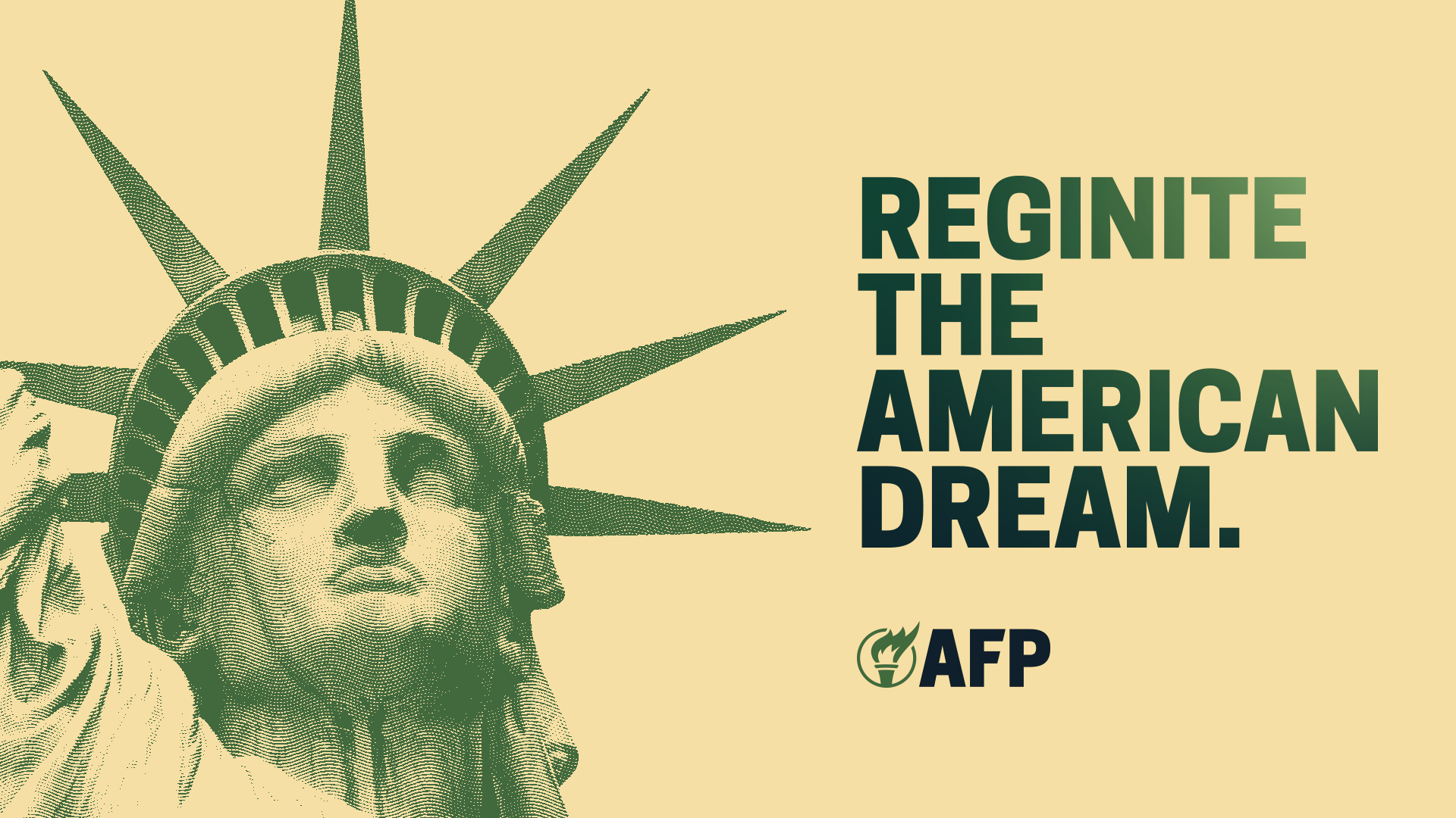
A grassroots effort to reignite the American Dream.
AFP’s visual identity had not been updated in roughly a decade. It was dated, lacked personality, didn’t allow for optionality, and did not contribute to the story the brand wanted to tell. Stakeholders didn’t want to stray too far from their history, wanted to keep green as their primary color, and hoped to keep “The Torch” as their primary visual element.
Key users in state chapters wanted more ways to use the visual identity and make it their own, as well as more guidelines as to how to properly interpret the visual identity. They wanted something they could build on, customize, and adapt to their needs while still being connected to the national parent brand.
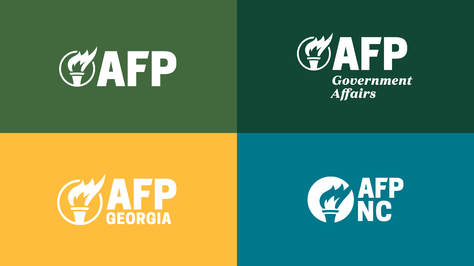
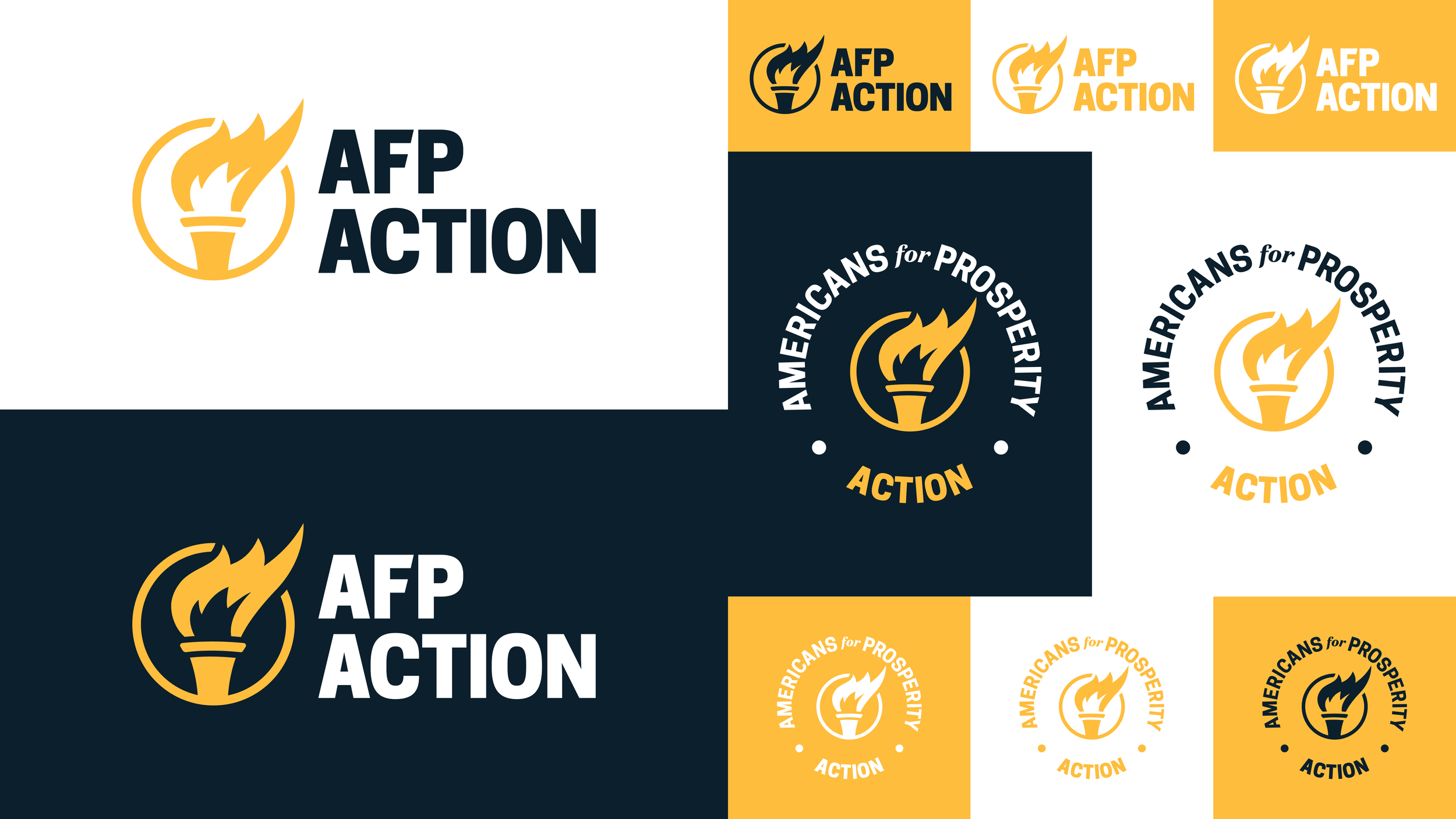
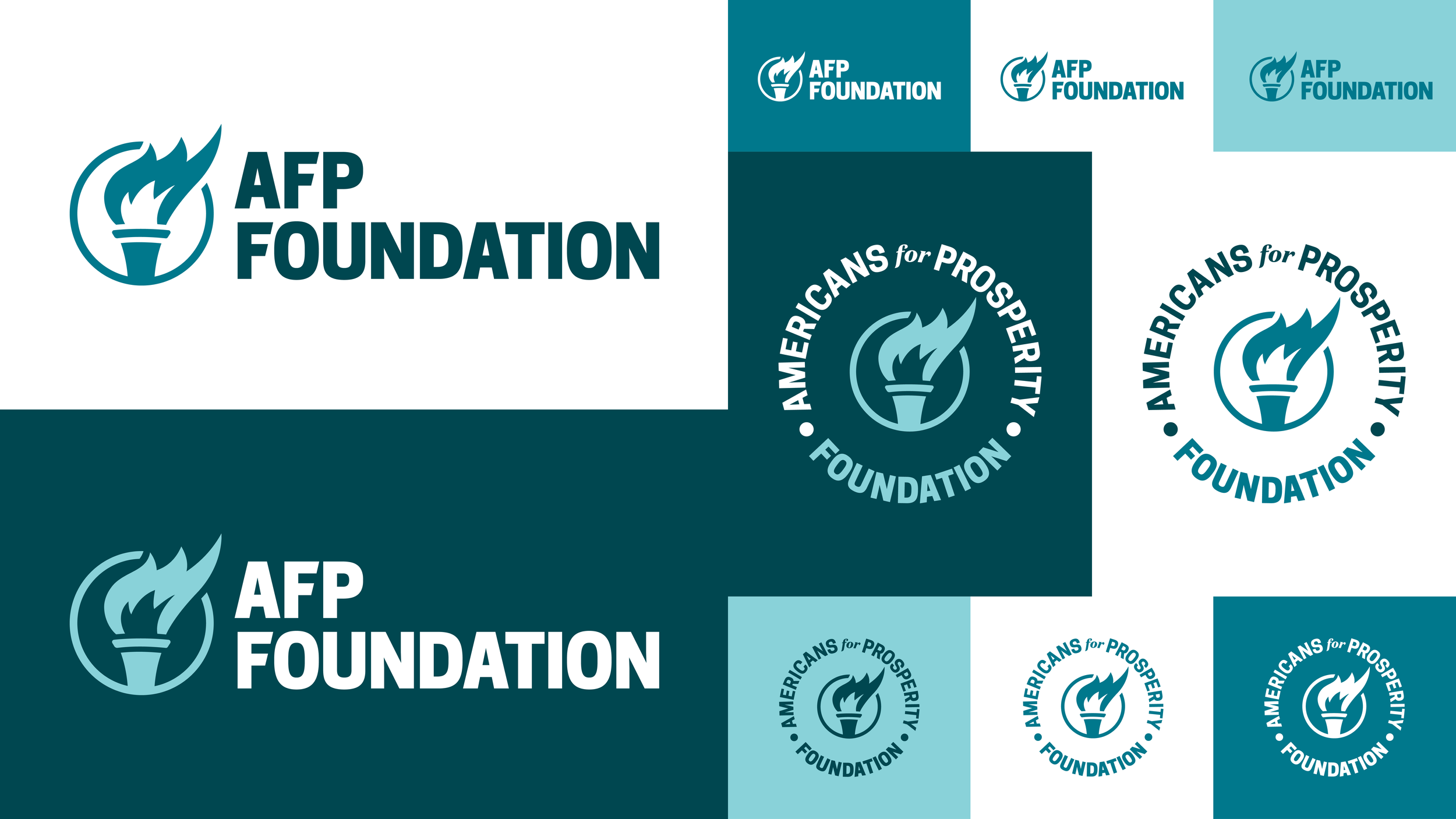
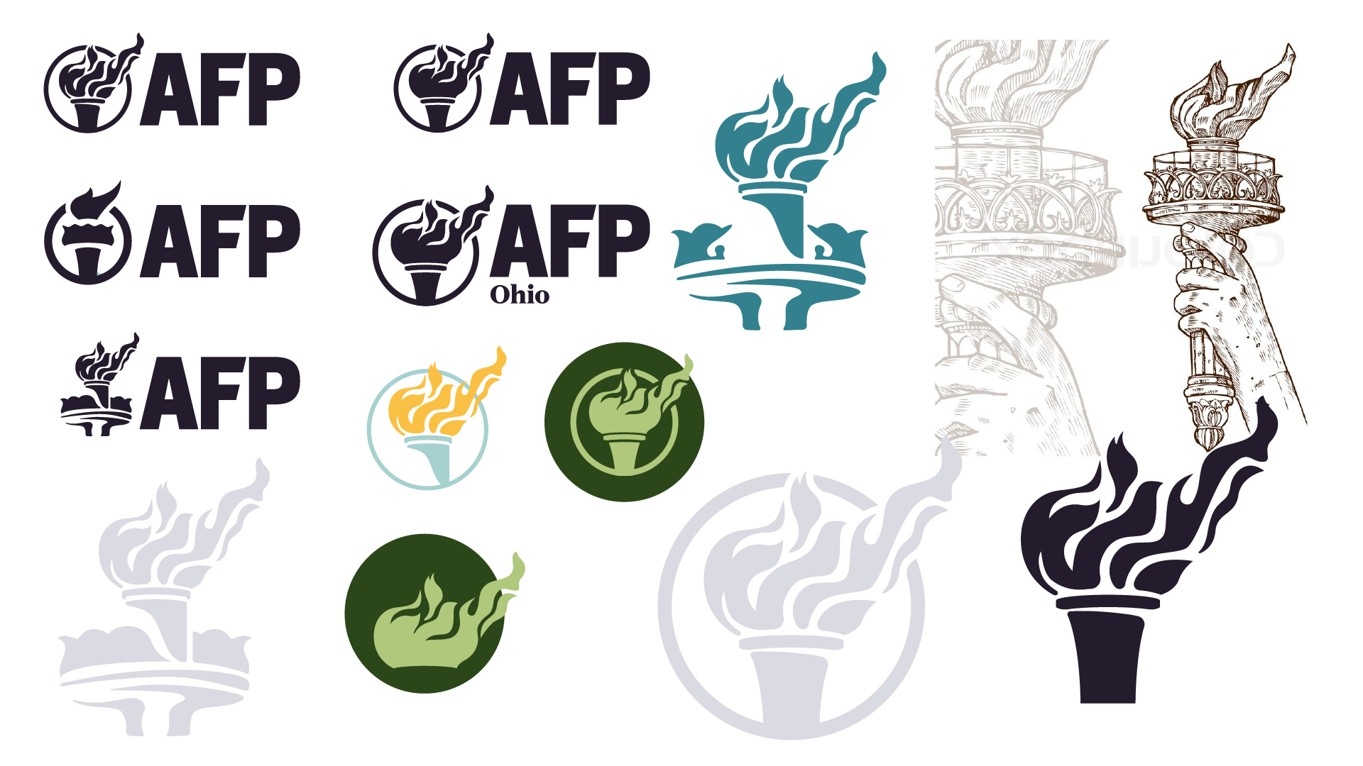
AFP and it’s subsidiaries had a collection of logos that no longer met the needs of modern brands. The typeface was ubiquitous. The arched line no longer had meaning. The small typeface for state chapters and other organizations did not work in small use cases. “The Torch” felt a bit disconnected. There was also no clear visual hierarchy, especially among the state, department, and affiliate organizations.

Inspiration:
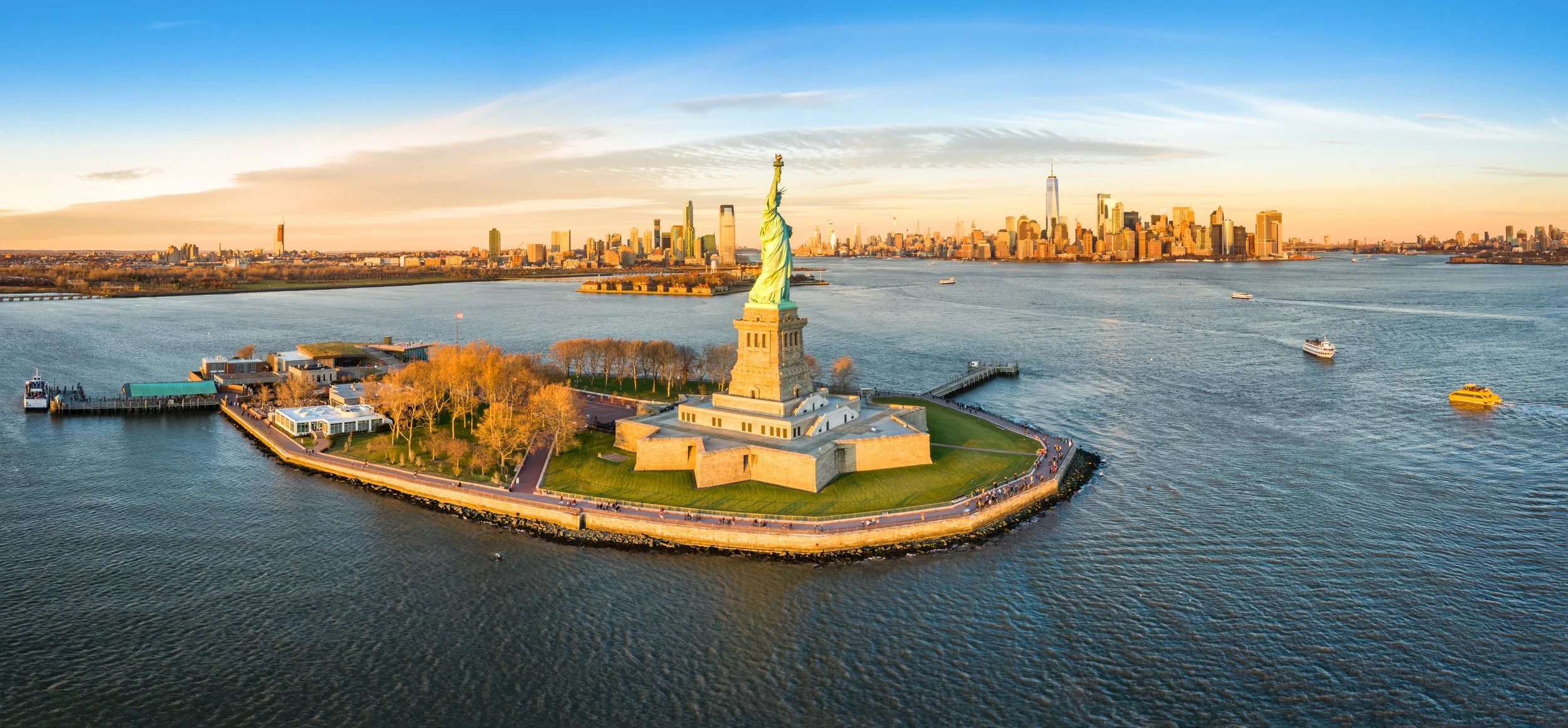
AFP stakeholders wanted to keep “The Torch” a primary component of their new visual identity. Given its tie to the Statue of Liberty, I decide to start searching for inspiration there. I purchased Ken Burns’ 1985 documentary The Statue of Liberty and set out to learn a bit more about Lady Liberty and her history. This was an obvious direction given Lady Liberty’s torch, but as a metaphor for ideation, connectivity, creativity, communication, and truth, it became even more compelling.

The Statue of Liberty was an engineering marvel in its time. Not only was the statue itself innovative, but the structure that held it up — designed by Gustav Eiffel of Eiffel Tower fame — was equally if not more so pioneering.
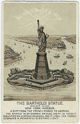
Additionally, while the French gifted the statue to the United States, they did not provide a place to put the statue, nor the funds to provide a place. A nationwide fundraising campaign commenced to raise money to build the Statue of Liberty’s pedestal. Advertisements appeared across the country soliciting donations. These advertisements , as well as those promoting the statue’s dedication, were a great source of inspiration for illustration styles and typography choices.
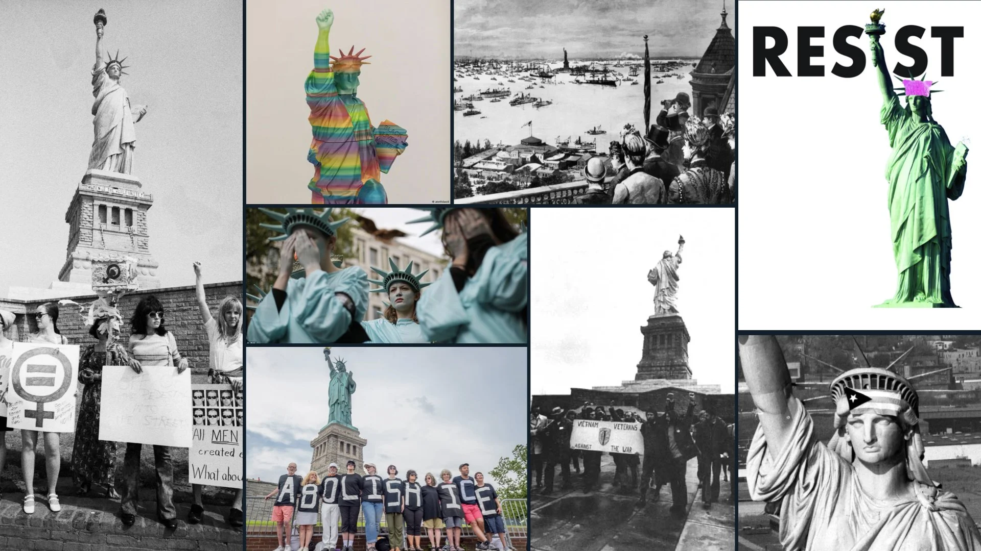
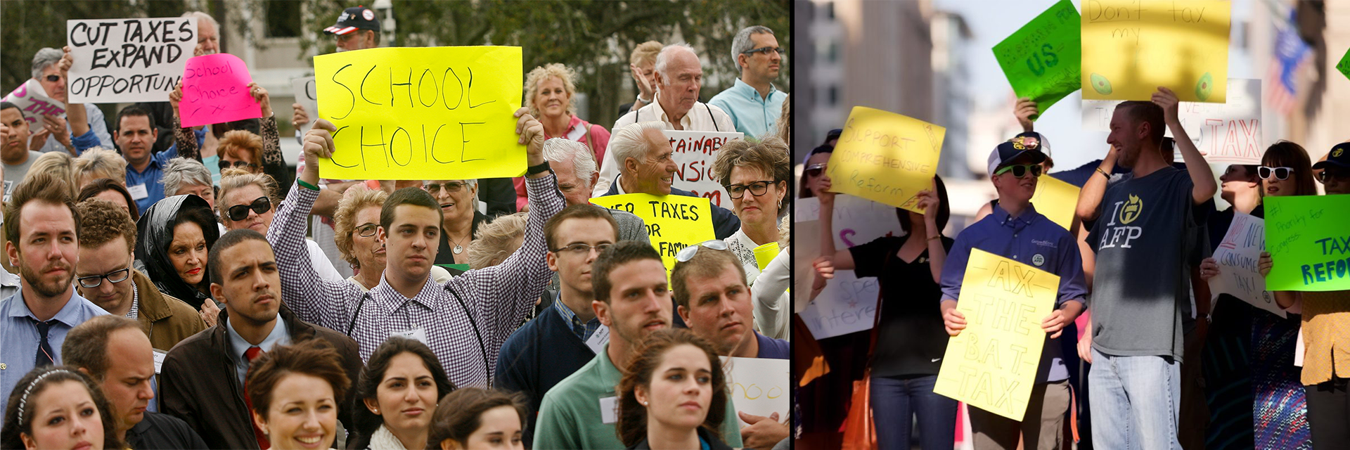
Finally, I learned that the Statue of Liberty has been a backdrop for and symbol of activism from its inception right up to the present day. In fact, suffragists protested at the dedication ceremony on October 28, 1886 because, though the statue was representative of a woman, hardly any women were allowed to attend the dedication ceremony. I thought this history of activism was a nice story arc for an grassroots advocacy organization.

Moodboard
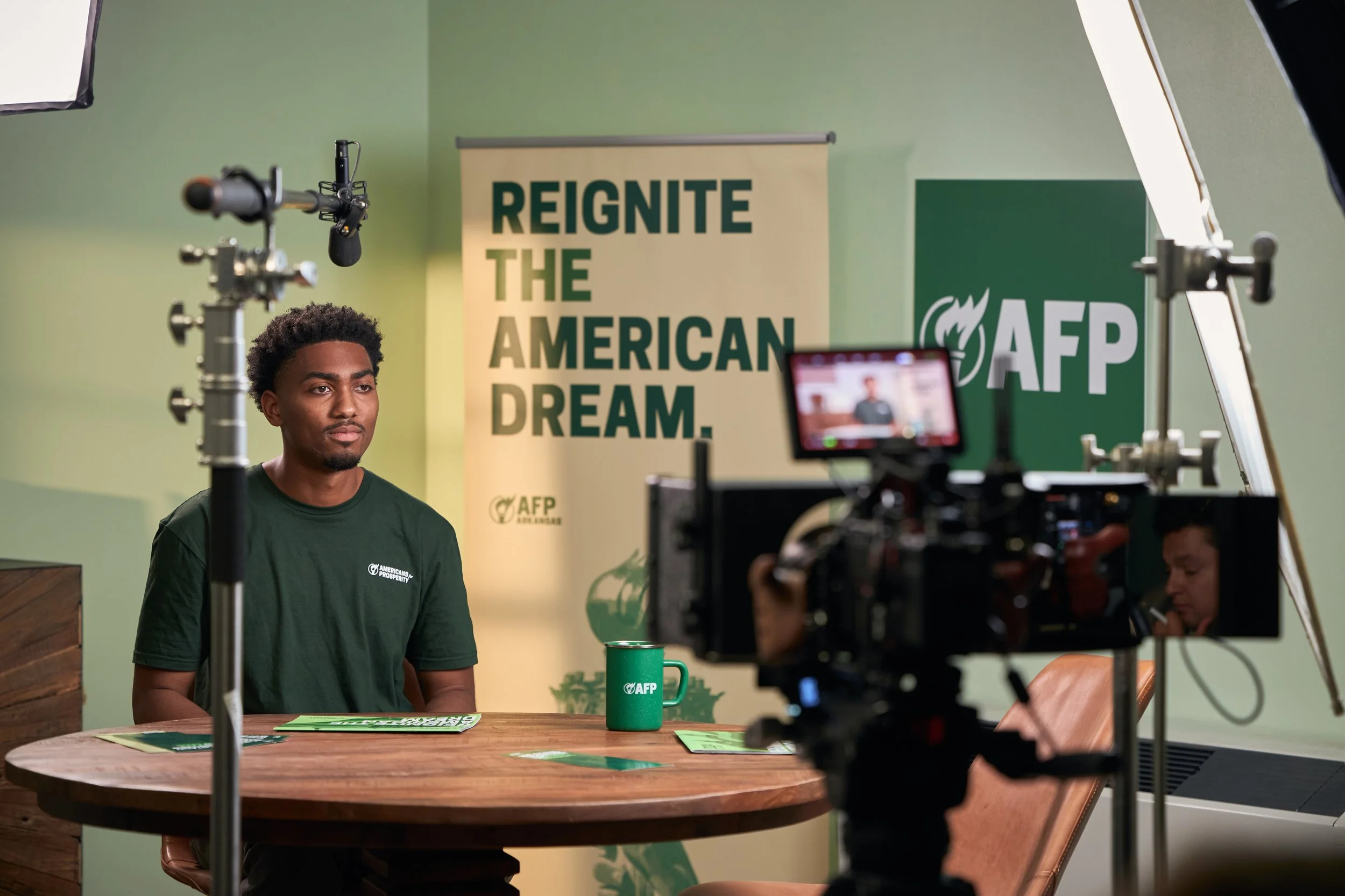
Stakeholders hoped to elevate the existing visual identity, making it more mature, and imbuing it with meaning. They wanted their brand personality to feel familiar to their grassroots teams and the average American voter. They were especially drawn to outdoor companies like Filson, and felt optimistic, “happy warrior” vibes perfectly embodied their brand’s personality.
Color Development
Light manifested in my approach most notably in the color palette and the logo exploration. Knowing stakeholders wanted to maintain green as their primary color, I looked to nature.

Pine and Evergreen allude to photosynthesis. Patina evokes color of the Statue, achieved through exposure to light.
Goldenrod was derived from the Statue’s torch. Copper was the original color of the Statue and reflects the conductivity that mineral makes possible. Sunrise was inspired by the early morning sky above the Statue.
Harbor, Ocean, and Sky were derived from the waters and sky surrounding the Statue.
Steel was drawn from the strength of Eiffel’s inner support structure. Mist came from the foggy mornings common over New York Harbor. Midnight references the dark night skies, pierced by the brilliant light of the Statue.
Logo Exploration
Continuing the light theme, I turned my attention to “The Torch.” The existing mark was adequate, but did not convey the energy you’d expect from something so symbolic. I also wanted something that felt more true to the actual torch, and something that had more movement. AFP refers to themselves as a grassroots movement, so I thought a mark that better reflected that would be ideal.
After several rounds of exploration with other designers on our team, as well as some fine tuning with our production vendor Poolhouse, we arrived at the new mark.
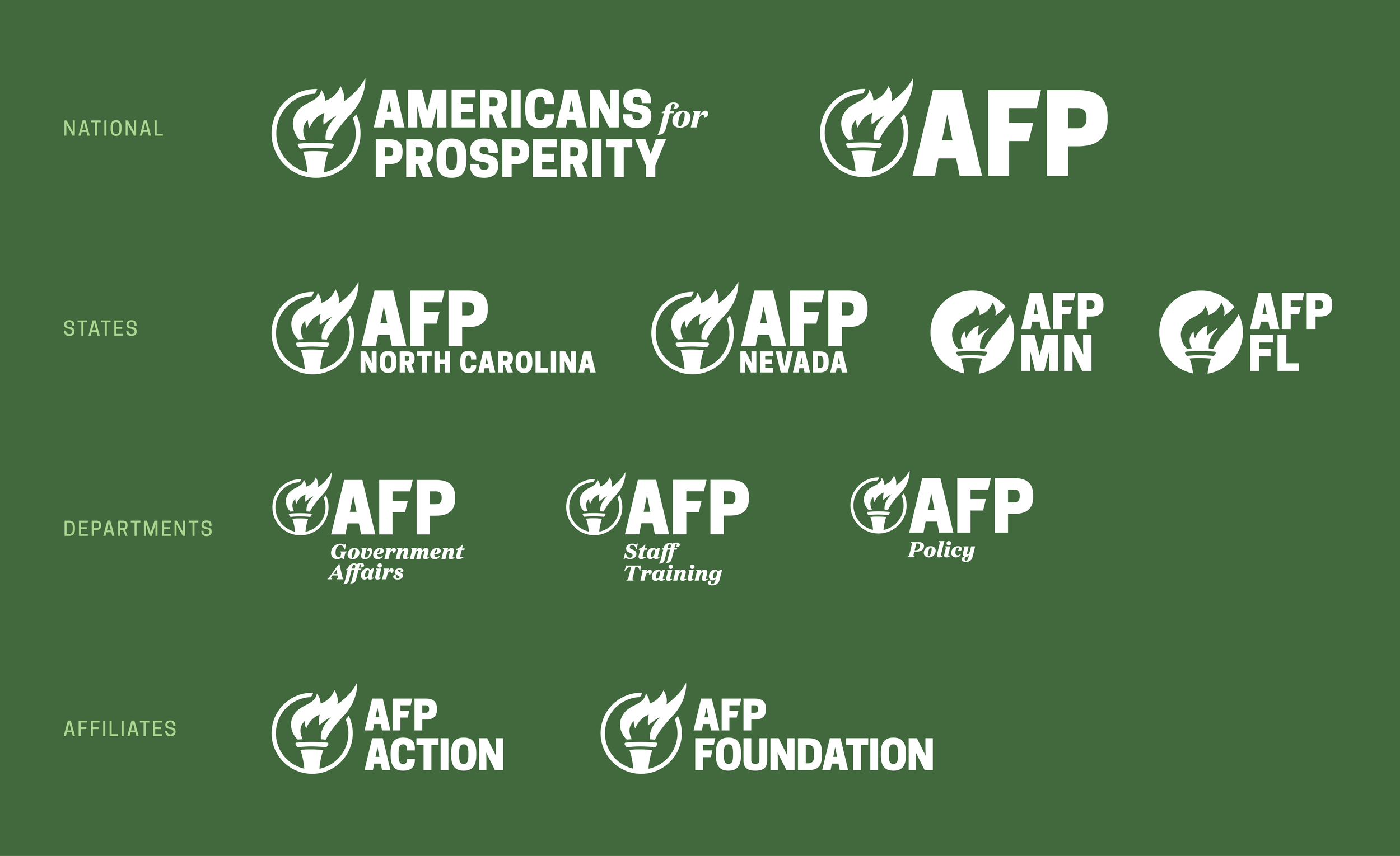
Along with an updated mark, I also had to tackle the myriad other logos and wordmarks, as well as their hierarchy and relationship to one another. This included wordmarks and lettermarks for 50 state chapters, wordmarks for several AFP departments, as well as wordmarks for two affiliate organizations, which required similar yet legally distinct visual identities.

Typography Exploration
Primary typography choices were drawn from newspaper ads and fundraising posters from the campaign to raise funds for the construction of the Statue of Liberty’s pedestal, as well as from the plaque bearing the text of The New Colossus poem by Emma Lazarus.
Handwritten typefaces and hand drawn elements were inspired by everyday Americans who have used the Statue of Liberty as a backdrop for activism, as well as the thousands nationwide who make up AFP’s grassroots coalition.